STILL LIFE 101

The eclectic 3D compositions of Laurent Allard breathe movement into a visual genre traditionally depicting the static. By employing digital tools, the artist creates a sense of fluidity in the materials, bordering on the grotesque and naive.

How would you describe the process of creating your artworks, from the idea to realization, or on the technical level?

I like to start with a strong idea, a particular desire, to guide my choices. I like to say to myself “it would be funny to associate this object with this other object, or this idea with this other idea”, and from there I try to find a dynamic to compose the image. To do that I quickly draw very small compositions to see what would work best. What are the masses and where are the voids. 

Untitled 8
Horse Studies

At this point, I often already have a small corpus of objects that make up the image. Then I have to enrich it, add to it without breaking the dynamic or compromising the basic idea; it’s often a longer step than one might think. When I am satisfied with what I have, I start modeling the objects in 3D. That’s when the basic idea starts to come to life, and that’s also when we see if it works visually or not, if we need to rework the composition. It’s research again, but rather technical. The basic idea has to be convincing, but so does its realization, otherwise I might want to move on to something else. 


Untitled 7
Untitled 9

What is a characteristic element that you use in your artworks?

I almost always use a black background, a relatively dark atmosphere and a single light source coming from one side. That’s what gives the “still life” look. But beyond lighting the objects in an elegant way, it creates a continuity between each visual, which allows me to be more free in what I want to represent. It avoids having to repeat myself to install a style, to be in the obligation to always apply the same recipe. The base remains the same, but everything else can change each time.

Are there particular stories behind the objects you use in your still life pieces? If so, can you give us details or share some of them?

There is no particular or personal story behind these objects, but since they are often related to childhood, it gives a feeling of closeness.

Zeit Campus artworks

I'm not sure why I'm attracted to certain types of objects yet, but let's just say they allow me to express an idea in a funny and grotesque way. It's like choosing one language over another.

In “Untitled 6”, there is the idea of confronting carelessness, lightness (cicada) and sedentary and comfort (snail). In “Horses Studies” it’s more about artistic representation, with the palette on one side, and the horse (the model) on the other side. 

Sometimes it’s less clear, like in “Untitled 7” where it’s the association of two totally artificial objects (a car deodorant and a candy) represented through the shape of a tree and a flower, that I liked. It’s like a kind of nonsense, and that’s enough for me to consider it “interesting”. Sometimes it’s better not to be too literal.  

But behind each object there is a function: some bring meaning, while others, like the chewing gum, are mostly there to create diagonals, guide the reading or even make two quite different images coherent.

How would you describe your style? Are there any artists that inspire you or have led you to the artistic expression you currently have?

I would say the grotesque, with an attraction to cartoonish figures, the kitschy, the trivial, but also an attraction to classical painting, symbols and metaphors. A ridiculous aspect with a serious background.

I love the work of Jamian Juliano Villani, and especially the freedom she has in her choice of subjects, in her style, her way of sampling images of very different nature, with each time a new idea for each canvas. I also like the work of Christian Van Minnen, especially in terms of rendering and atmosphere. The painter Antwan Horfee is also a very important reference for me, in his way of transcending cartoon/graffiti imagery, to take it further. I also love Austin Lee’s work, for its grotesque and ridiculous but totally unique look.

Did you like it?
Share it with your friends

Bio

“I am not necessarily attracted by the possibility of doing sensational things, which in fact reminds us that 3D is false, I prefer to do simple things, quite modest or even trivial, but which would have been very complex to do in a real life photoshoot.”

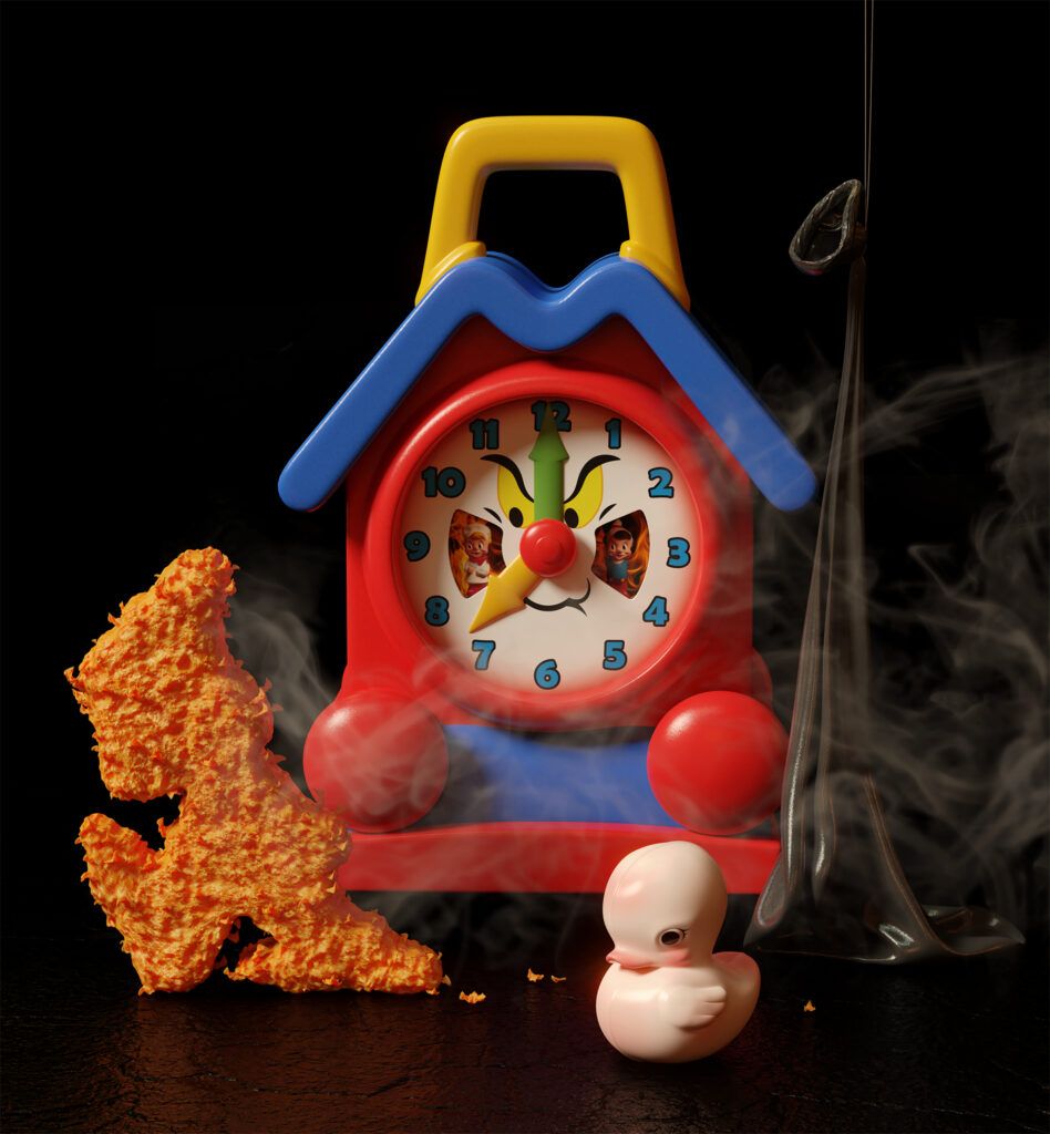
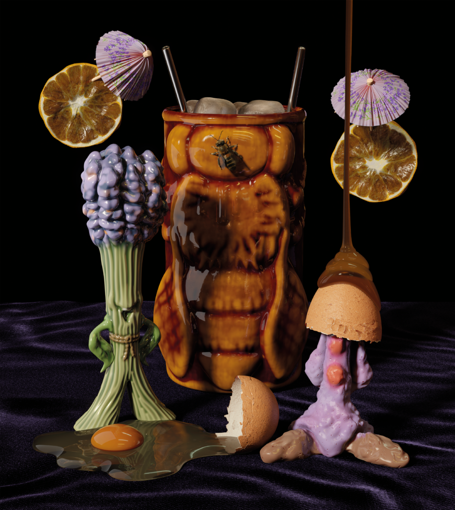
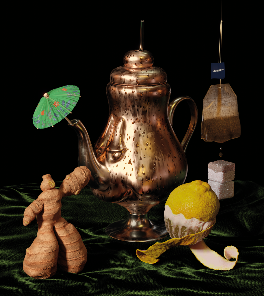
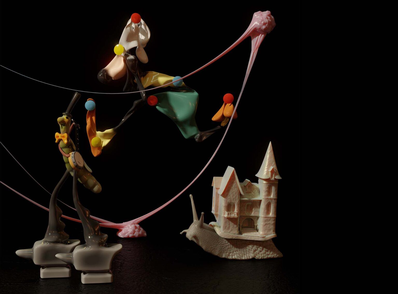
In his work, mainly in 3D, he likes to create images as visual jokes, mixing objects of very diverse nature, both trivial and consumer goods, as handmade and naive looking, to make grotesque compositions that seem to have a hidden meaning behind the obvious joke.

He likes to mix materials such as wax, porcelain or even chocolate, thanks to the medium of 3D, giving him total freedom on the desired photographic rendering, bathing the whole in a light and a classic still life atmosphere.

“Of course I like the cartoon style, in a postmodern way, but I never wanted to have a style that risked becoming a straitjacket. I don’t want to have to use the same recipe for every picture, but rather be driven by a new idea.”

Credits

Artworks / Laurent Allard @hospice_1er

Interview / Markéta Kosinová

Artwork “Zeit Campus” is a commissioned artwork for the German magazine Zeit Campus


VIDEO

Music / @maoupa_mazzocchetti – Serenade To a Gelatine (feat. @zulimusic)

Album / UXY Dosing©

Label / BFDM Records (BFDM025)

Video / Laurent Allard @hospice_1er

Art Direction / Laurent Allard & Maoupa Mazzocchetti

Starring / Dextrose

You may also like

“It is a story about a long night, about everything that disappears during the day and only comes out after dusk.” Polish fashion designer Pat Guzik breathes new life into her garments by collaborating with visual artists, such as Aleksandra Waliszewska and Zbiok Czajkowski, whose dreamy and tongue-in-cheek works adorn the skirts, sweatshirts, jackets, and other ready-to-wear pieces by the designer.
French painter and illustrator Sébastien Pastor navigates between naïve figuration and abstract expressionism, building visual worlds where bold color palettes pulse with rhythm and absurdity. Discover how his colorblindness became a creative signature and how he leaves room for the enigmatic in his works.
Spanish illustrator Laura Mestre transforms emotional overflow into tender visual poetry, using symbols of water, flowers, and cracks to map the quiet beauty hidden within difficult experiences. Discover how metamorphosis, instinct, and a fanzine called "Hay que volver" helped her reclaim drawing as both refuge and release.
In my last year’s review, I wrote that some part of me wished to keep PAF jealously to myself. Either that wish has not been intercepted in the ether or has been twisted completely because the 2025 edition of PAF, Festival of Film Animation and Contemporary Art in Olomouc, Czechia, was bursting at the seams; again. However, it’s one of the Czech festivals that deserves to be sold out and a bit cramped, and I’ll tell you why.