Your transition from flat graphics to 3D and short 3D animations is intriguing. Can you share more about what inspired this shift and how it has influenced your creative process and storytelling in your artwork?
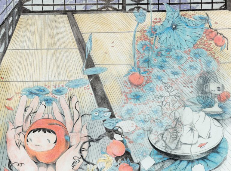
The beauty of an image is that it can tell a story in any order you want. Like Rayuela by Cortázar. And even more. When the image is a carpet with evenly distributed details along the plane, you delegate to the viewer the choice to set priorities and choose the main characters in the plot, which can also be still lifes and landscapes in which living objects are placed. I had 3 problems: first, the number of ideas greatly exceeded the time frame within which I could implement them – a realistic, accurate rendering, which my ideas required, meant weeks of night drawing after work. Here are examples of what I did before 3D.
https://www.flickr.com/photos/cirrusmin0r/albums/72157698321451405
Second, I don’t think in visual images. My ideas start with text. This meant that I left decisions about composition and lighting to the last minute, which sometimes made the readability of objects suffer. Switching to 3D helped me solve these issues. The computer does the ray tracing for me – the cold realism of the render is needed to reduce the obstacles between the viewer’s vision and the picture. Hand graphics are another layer to the message. I would like to be closer to the seeming impartiality of photography – it is also a cute, outdated antics about the truth of the subjective. But after that, the number of symbols and their decorations simply did not fit into a single picture. My husband suggested that I place objects in time when they no longer fit in space. This opened up a magical room of cause and effect to my graphics.
Nature Kosmos
(art pieces above)
In a review of an article in the journal Science, Haeckel’s drawings were called falsified. It is about how passion leads to distorted representation, but in turn, illustrates the process of development better than a faithful representation.
Linear development notation. A triptych comic strip depicting the different contents of the stages of a single form – human aspirations.
A repeating form is about the imitation of another form of life, becoming undefinable within the framework of familiar categories, in order to continue to exist, to survive, to live, to let life flow.
astronomy | youth | theory | idea | pantheism |
biology | heyday | practice | reality | materialism |
physics | degeneration | experience | vision | natural philosophy |
1/ The first triptych part Astronomy is about the evolution of human cognition.
Astronomy is also a symbol of the youth of mankind, theory, an emerging idea, and pantheism, as the most organic form of understanding the world by a human-child.
2/ The Biology part is about the evolution of human cognition.
The dawn of understanding the world, the era of enlightenment, and anthropocentrism have grown into practice. Reality and materialism are pushed off from a suddenly realized point in the form of a person.
3/Physics – the evolution of human cognition.
Degeneration is a natural fruit of experience. Vision and return to the unification of the recognized relativism of the flawed human nature with mature science into natural philosophy.
“Every true science is natural philosophy.”

St.Lazarus
(art piece above)
An African (Christian) saint, self-suspended in his raffia, protected and penetrating through it.
The hemorrhagic rash looks like decorative flowers, a traditional gemstone pattern. The manifestations of the disease are a sign, significance, as a jewel, value. This is a privilege that you cannot acquire on your own, like other privileges – only fate decides who is entitled to which attribute. It is awe of the disease/unknown.
Reddened abscesses – this is the territory of Lazarus. Interestingly, leprosy is very similar to smallpox. Thus the form (external) creates a softer transition from belief in the Obaluayie to the Christian Lazarus. And leprosy breast abscesses are a very Christian thing. Like the sacred feeding of Jesus and again different forms of sucking his blood.
The inertia of folklore is expressed in one more detail. The mixing of the two guises with a skin tone – a royal purple for the African spirit and a palette of asceticism from the images of Lazarus.
Straw with a metallic sheen to accentuate the limiting properties. Saint Lazarus was in captivity of worldly adversity, and Obaluayie found how to cover them. Psychological comfort (self-selected frontiers-security constraints) and troubles always go together – sometimes they are the same thing, sometimes they are conflicting concepts.
The whole shape of the nets creates the silhouette of a thorn, which was used to denote Babalú-Ayé. “This could be seen as the typical colonialist fear of contamination, or it could be the opposite, a natural, plant-formed inoculation device.”

In your work, you often use metaphors, vibrant colors, and high detail to convey the magical side of your themes. How do these artistic choices contribute to the overall atmosphere and emotional impact of your art?
Metaphors are the language of the heart that all people know. We all want to feel something for more than a second followed by a loss of attention. I try to stretch this moment, at least for myself, in these works.
Alas, I don’t consider colors and details to be a conscious choice – it’s something that other artists and neuroticism (a blind belief that the quality of work depends on complexity and an escape from my stupidity) instilled in me. I also think that my works are bright, because I don’t know how else to express admiration for the miracle of life. I select the color scheme to match the task – it turns out that the tasks I come across are mostly life-affirming or about escapism.


Your favourite ideas seem to revolve around the intersection of fairy tales, fashion, everyday life, and classic art. Can you tell us more about the appeal of blending these diverse elements and how they come together in your artwork?
What could be more exciting and simpler than a myth? These images necessarily appear in the head – they need to be released so as not to sour. I see fashion as the poetry of capitalism. It is surprising that the world in any era strives for creative self-determination. It’s worth a look. What appears on the podium is the digested pain of a modern person, professionally adapted for understanding by huge groups of people, in contrast to the artisanal ways of conveying the actual by artists. That is, fashion takes the complexly formulated thought of modern art, our melancholy, a glamorous look at the global catastrophe and produces a clear visualization, a mirror of the time, of this year, even half a year.
Any interests that arise in my head, which are sometimes incompatible, can only be held together by the glue of canons developed over centuries – the focus of artists’ attention, the veneration of nature and man. I enjoy exploring the world through contemporary art, but to create my own I choose the principles of William Morris, for example, or Böcklin. I believe that this desire for an unattainable ideal should be felt in the work in order to lure the viewer into more complex concepts.


You mention that some core aspects of your style are smooth lines, high detail, and a surreal narrative with an exotic atmosphere. Could you delve deeper into the symbolism and significance of these elements in your work?
The lines are what the person in the picture is looking at. The viewer must be respected, as well as the grace of nature from which this fluidity comes. Each detail in the same way should have semantic weight. The pictures are there for entertainment. I am for the entertainment to be long and interesting. I’m crazy about artists who flirt with you, hide something, and make you feel the joy of the game. Sometimes I don’t have enough of this and then I create such things myself.


Can you share some insights into your creative process when starting a new project? How do you typically approach concept development and execution, especially when working on 3D animations?
It all starts with collecting information, looking for the starting point of the problem of interest and the blind spots where it ended now. It is necessary to find out the shape of this spot as much as possible to build everything around it with a figurative art form. And that’s it, I have a set of words in my hands. Objects are designed to convey their meaning – they are real-world forms with an upgrade that conveys the core thicker. The environment is built according to the same principle. What I do reminds me more of scenography and construction kits.
Animation is a miracle of transformation. And I am still learning to speak from this treasured way of expression, instead of the usual fixation of the scheme of life.

Are there any upcoming projects or themes you are excited to explore in your upcoming artwork?
After I finish the motion design course, I will remake my animated film “Virtuality Ontogenesis”, which was presented at the Estonian film festival PÖFF.
So I’m going to keep on working on short films, mostly music videos, with a simple structure to continue to find a balance between aesthetics and semantic complexity. In parallel with how I get older, I am increasingly inclined to believe that there should be more eye candy in this duet.
We cannot change the world with ungrounded ideas. Many supposedly familiar phenomena require endless updating of formalization. The area between the transcendence of art and the utility of illustration is much more in need of filling than we think.


